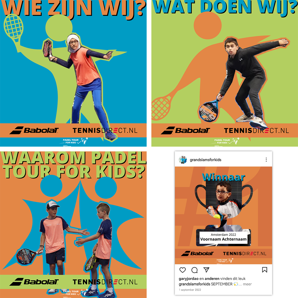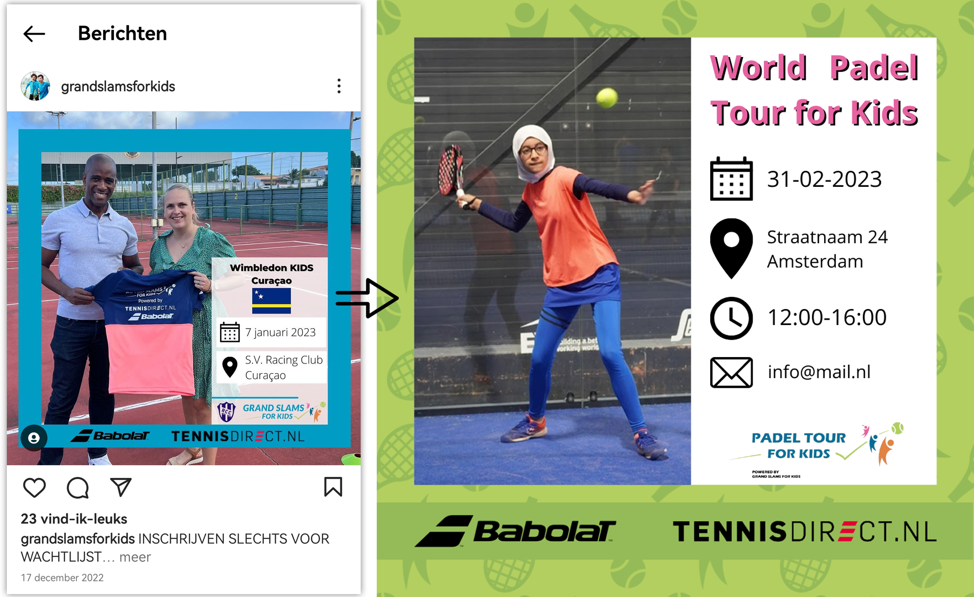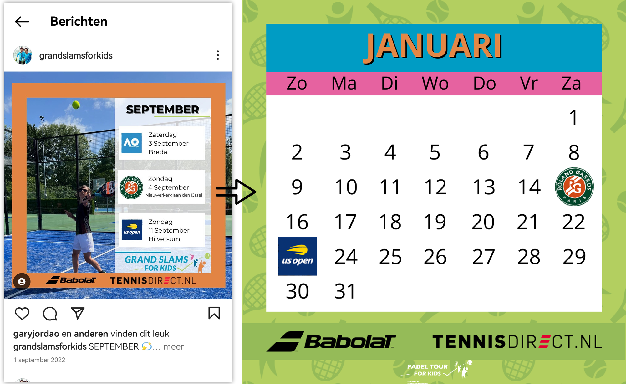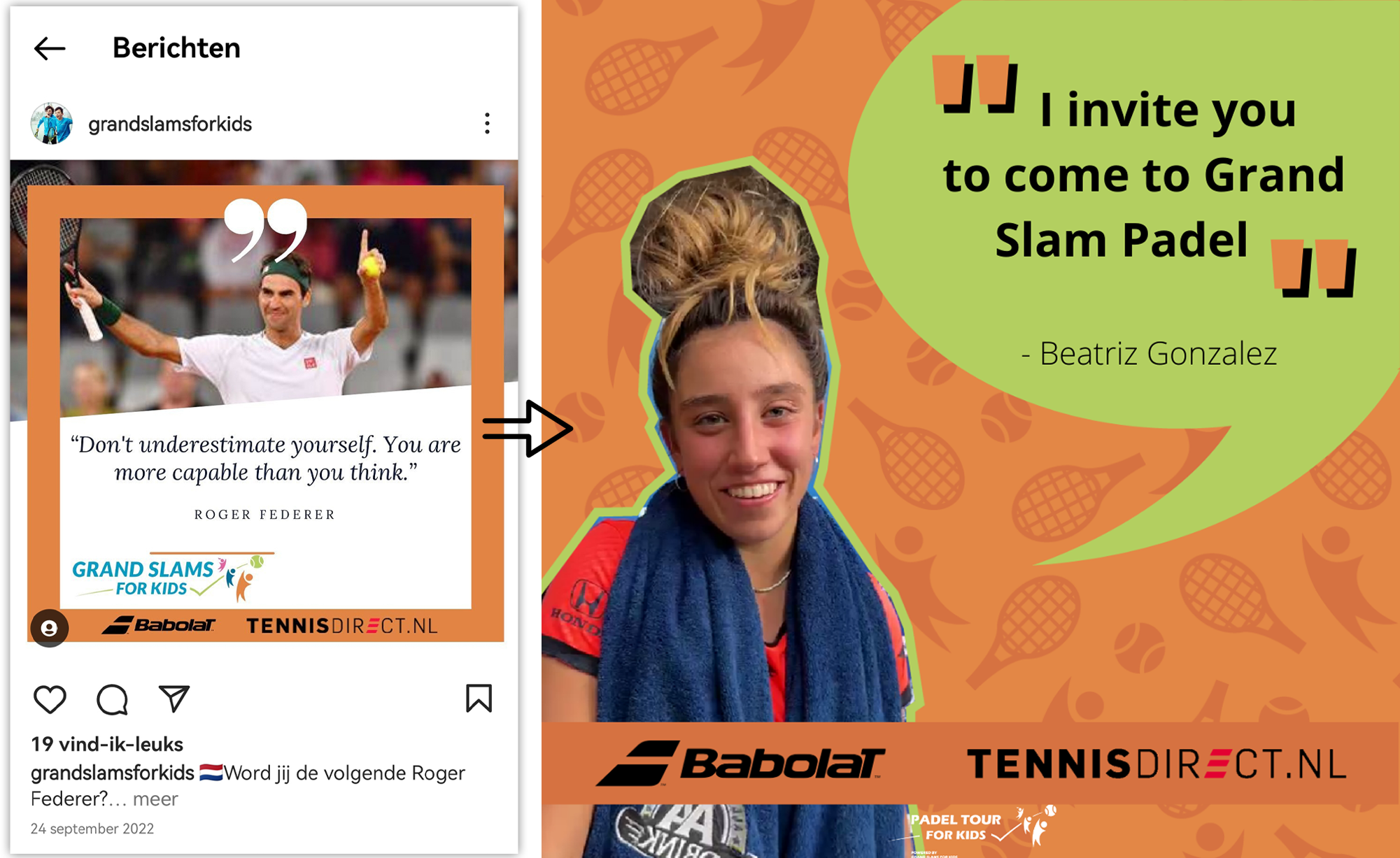

The requirements were that people needed to associate the new identity with the overall feel of Grand Slams for Kids and that there had to be space for the mention of the two main sponsors.
After researching their instagram and website, I decided to take the two main things that stood out to me positively. The colours and logo.
Grand Slams for Kids has four colours main colours, blue, orange, green and pink. And in their logo are three puppets. These are the elements that bring a fun playful feel. Exactly what is needed for this organization targeted towards kids.
The new style uses much more colour and different shapes, it is playful and bright. You immediately associate it with a fun and children.


